tailwindCss tips and tricks
This is a place where I'll be keeping track of some tailwindCss tricks and tips that I've discovered. I thought I'd share them for everyone else too.
Prerequisites
IDE Plugins
Before you start using tailwindcss, be sure to add the recommended IDE plugins. These 2 are a must if you use VSCode:
- Tailwind CSS IntelliSense
- Provides tailwindcss intellisense to your IDE and also includes your custom extended classes that are defined in the tailwind config
- Tailwind Docs
- Use this to search the tailwindcss docs in your IDE and it opens the docs on the chosen feature in the IDE for you.
Divide
You may have come across a design that requires elements to be grouped together in a container that are then divided with a border to represent the individual sections. Something like the below example:
The HTML and CSS for this:
<div class="flex p-5 justify-center gap-3">
  <div class="border-solid border-r-[1px] pl-5 pr-10">Option 1</div>
  <div class="border-solid border-r-[1px] pl-5 pr-10">Option 2</div>
  <div class="pl-5 pr-10">Option 3</div>
</div>
You'll see that you have to assign a border to each of your elements in the container, except for the last element, where the border is not needed.
You can see that to maintain a list of options for a dynamic list of options we would need to either add/remove the classes from the elements or get creative with CSS nth to remove the last element border.
This is where tailwind's divide class comes in. divide is a utility class that allows you to divide your elements in a container with a border on each element.
We can recreate the above effect by using the divide utility class, shown below:
The HTML and CSS for this is a lot leaner and less specific:
<div class="flex flex-col md:flex-row justify-center gap-3 mb-5 divide-y-[1px] md:md:divide-y-0 md:divide-x-[1px]">
  <div class="pt-3 md:pt-0 md:px-5">Option 1</div>
  <div class="pt-3 md:pt-0 md:px-5">Option 2</div>
  <div class="pt-3 md:pt-0 md:px-5">Option 3</div>
</div>
This can be extremely useful when creating dynamic lists with a UI framework as you don't need to add or remove any particular classes depending on the length of items or create a CSS rule that removes a border from the last element.
It's also very useful when you're working with responsive design. You can easily change the border from left/right to top/bottom or vice-versa. You'll see I've added some tailwind responsive classes to control the border and padding.
I'd recommend having a look at tailwind's docs for more details on divide-width, divide-style and divide-color.
Peer & Group
Group
Group is useful when you need to style elements within a container. The use case I'm going to use for this is: you have a card that contains multiple child elements that you would like to change the styling of when a user hovers over each card to highlight the user interaction.
You set a class of group on the parent container and add a class of group-hover: to the child elements you want to be updated when the user hovers over any part of the group.
Here's a super ugly demo of what this does:
Group Demo:
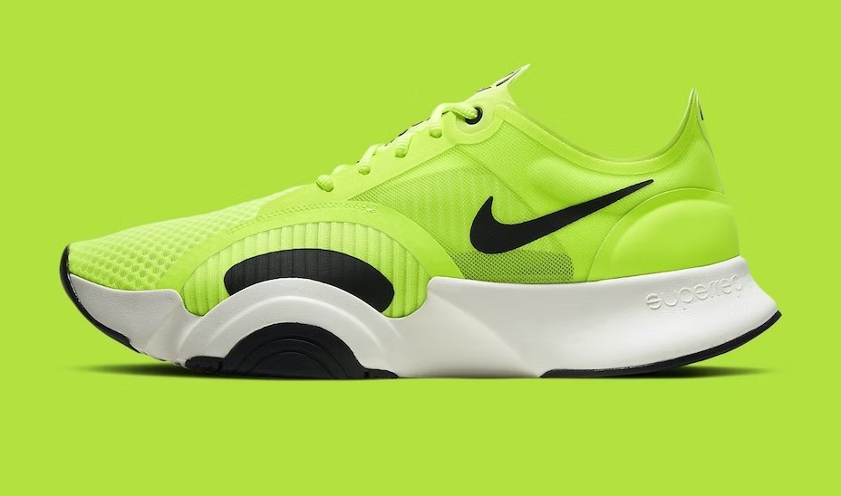
You need running trainers
Can't go wrong with trainers like these... well, you can with this colour 😜!
The Code for this:
<div class="container w-full max-w-80 mx-auto">
  <div class="group card w-full mx-auto bg-base-100 shadow-xl">
    <figure>
      <img src="https://daisyui.com/images/stock/photo-1606107557195-0e29a4b5b4aa.jpg" alt="Nike trainers in a, high-vis jacket, yellow" class="transition-all group-hover:scale-150" >
    </figure>

    <div class="card-body">
      <h4 class="card-title m-0 my-2 transition-all group-hover:text-red-600 motion-safe:group-hover:animate-bounce">You need running trainers</h4>

      <p class="transition-colors group-hover:text-primary motion-safe:group-hover:animate-pulse">Can't go wrong with trainers like these... well, you can with this colour 😜!</p>

      <div class="card-actions justify-end">
        <button class="btn btn-secondary motion-safe:group-hover:animate-spin">Buy Now</button>
      </div>
    </div>
  </div>
</div>
Peer
Peer is useful for when you want to effect the sibling element of an interacted element... E.g: A user may hover over one card and you want to higlight the sibling card.
To achieve this you would add a class of peer to the element you want the user to hover and then add a class of peer-hover to the sibling.
Peer Demo:
You need running trainers
Can't go wrong with trainers like these... well, you can with this colour 😜!
You need running trainers
Can't go wrong with trainers like these... well, you can with this colour 😜!
<div class="container w-full mx-auto flex flex-wrap min-[450px]:flex-nowrap gap-5">
  <div class="peer card w-full mx-auto bg-base-100 shadow-xl">
    <figure>
      <img src="https://daisyui.com/images/stock/photo-1606107557195-0e29a4b5b4aa.jpg" alt="Nike trainers in a, high-vis jacket, yellow" class="transition-all" >
    </figure>

    <div class="card-body">
      <h4 class="card-title m-0 my-2 transition-all">You need running trainers</h4>

      <p class="transition-colors">Can't go wrong with trainers like these... well, you can with this colour 😜!</p>

      <div class="card-actions justify-end">
        <button class="btn btn-secondary">Buy Now</button>
      </div>
    </div>
  </div>

  <div class="peer-hover:opacity-50 transition-opacity card w-full mx-auto bg-base-100 shadow-xl">
    <figure>
      <img src="https://daisyui.com/images/stock/photo-1606107557195-0e29a4b5b4aa.jpg" alt="Nike trainers in a, high-vis jacket, yellow" class="transition-all" >
    </figure>

    <div class="card-body">
      <h4 class="card-title m-0 my-2 transition-all">You need running trainers</h4>

      <p class="transition-colors">Can't go wrong with trainers like these... well, you can with this colour 😜!</p>

      <div class="card-actions justify-end">
        <button class="btn btn-secondary">Buy Now</button>
      </div>
    </div>
  </div>
</div>
Breakpoints
Ranges
This is a small trick to help refine responsive layouts. You can use a range of sm: and md: to create layouts for specific widths. E.g: imagine a grid column layout you may want to have a grid col layout of 6 columns but on mobile you only want to have it as a 2 column layout.
You would have a parent with the following classes grid grid-cols-2 gap-10 md:grid-cols-6. This will give you 2 columns on mobile and then 6 on anything larger than the md: breakpoint. This is because tailwindCss is mobile 1st and we apply the styling we want for anything larger than mobile using the md:, lg:, xl: 2xl: classes.
Lets say, for whatever reason, we only want 6 columns for a specific range of breakpoints. The below will give us 6 columns between the sm: and max-md: breakpoints: grid grid-cols-2 gap-10 sm:max-md:grid-cols-6
It would look like the following, from 2 columns to 6:
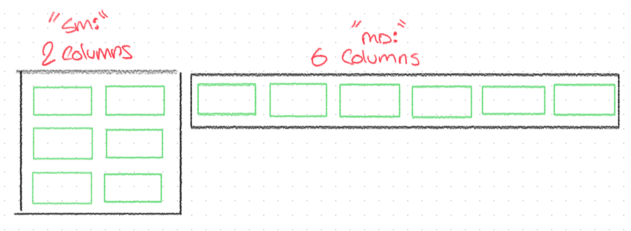
Range Demo
You may be able to view this on mobile if you rotate your device
The Code for this:
<div class="w-full grid grid-cols-2 gap-2 h-auto shadow-xl sm:max-md:grid-cols-6">
  <div class="col-span-1 bg-base-100 shadow-xl border-solid border-green-200 border-2 w-autp h-20"></div>
  <div class="col-span-1 bg-base-100 shadow-xl border-solid border-green-200 border-2 w-autp h-20"></div>
  <div class="col-span-1 bg-base-100 shadow-xl border-solid border-green-200 border-2 w-autp h-20"></div>
  <div class="col-span-1 bg-base-100 shadow-xl border-solid border-green-200 border-2 w-autp h-20"></div>
  <div class="col-span-1 bg-base-100 shadow-xl border-solid border-green-200 border-2 w-autp h-20"></div>
  <div class="col-span-1 bg-base-100 shadow-xl border-solid border-green-200 border-2 w-autp h-20"></div>
</div>
Spacing
When you have a list of items, maybe an un-ordered list of Todo's for familiarity of tutorials, you may have used m[axis/direction]-[number], e.g: my-4, to add spacing between the list items:
<ul>
  <li class="my-4">Item 1</li>
  <li class="my-4">Item 2</li>
  <li class="my-4">Item 3</li>
  <li class="my-4">Item 4</li>
  <li class="my-4">Item 5</li>
</ul>
Which would give you the following:
- Item 1
- Item 2
- Item 3
- Item 4
- Item 5
Or you can use flex or grid, although you wouldn't use grid for this, and use the gap-[number] class to add spacing between the list items:
<ul class="flex flex-col gap-2">
  <li>Item 1</li>
  <li>Item 2</li>
  <li>Item 3</li>
  <li>Item 4</li>
  <li>Item 5</li>
</ul>
Which would give you the following:
- Item 1
- Item 2
- Item 3
- Item 4
- Item 5
BUT, you can do this in an easier way! tailwindcss provides a space-y-[number] class that does this all for you:
<ul class="space-y-4">
  <li>Item 1</li>
  <li>Item 2</li>
  <li>Item 3</li>
  <li>Item 4</li>
  <li>Item 5</li>
</ul>
Which gives you the following:
- Item 1
- Item 2
- Item 3
- Item 4
- Item 5
All the outputs look the same, but I assure you that rendered outputs are actually different Vue components being rendered!
You can use space-x-[number] to add spacing along the x-axis, or just use space-[number] to add even spacing on both axis 👌🏽.
... more tips to coming...